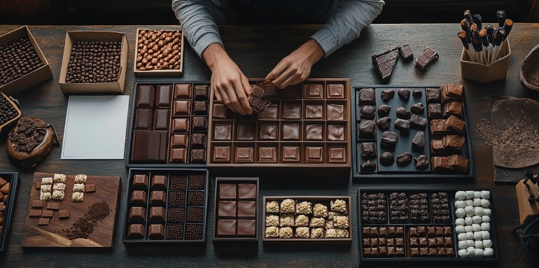
Walk into any modern retail store and stand in front of the chocolate aisle for just a minute. What you’ll see is not just a range of products, but a battlefield of color, texture, shine, and shape. Dozens of brands compete in a narrow visual strip of space, each trying to claim a fraction of the shopper’s attention.
Most customers do not taste before they buy. They do not read the ingredient list in detail. They rarely compare cocoa percentages or sourcing origins on the shelf.
They look. They feel. They decide.
In the chocolate industry, packaging often determines whether a product even gets the opportunity to be tasted. Before flavor, before quality, before brand loyalty, there is perception. And perception is built visually.
The Three-Second Decision
Consumer behavior studies consistently show that shoppers make initial purchase decisions within seconds. In impulse-driven categories like chocolate, that window is even smaller. The human brain processes visuals far faster than text, and it relies heavily on mental shortcuts.
When standing in front of a shelf, consumers subconsciously ask:
- Does this look premium?
- Does this look trustworthy?
- Is this worth the price?
- Does this match my mood?
These judgments are formed almost instantly, and packaging provides the answers.
In many cases, taste influences repeat purchase, but packaging drives the first one. For brands operating in a crowded chocolate industry, that first purchase is everything.
How Design Psychology Works in Chocolate
Chocolate is not just a snack. It is an emotional product. It represents indulgence, reward, comfort, gifting, celebration, and sometimes even stress relief. Because of this emotional association, packaging must communicate feeling, not just information.
1. Color as a Quality Signal
Color choices in chocolate packaging are rarely accidental. Darker shades such as deep brown, black, or burgundy, often signal richness and sophistication. Gold accents imply premium quality. Bright reds and yellows can communicate energy and affordability. Consumers interpret these cues instinctively. A dark chocolate bar wrapped in muted matte black suggests intensity and luxury. The same product in a glossy, bright wrapper might feel inconsistent with its positioning.
Color creates expectation. And expectation shapes perceived taste even before consumption.
2. Texture and Material Influence Perceived Value
Physical interaction plays a significant role in retail environments. A thick carton, embossed lettering, or a soft-touch matte finish can dramatically elevate the perceived value. Research across categories shows that heavier and more tactile packaging makes products feel higher quality. In the chocolate industry, where premiumisation is accelerating, these subtle cues influence willingness to pay.
Consumers may not consciously analyze the finish of a wrapper, but they feel it. And that feeling affects whether a product justifies its price.
3. Typography and Layout Shape Brand Personality
Fonts and layout decisions communicate brand identity instantly. Minimalist typography with clean spacing suggests modern sophistication. Handwritten fonts imply artisanal craftsmanship. Bold block letters can signal mass-market familiarity.
In a category as saturated as chocolate, typography answers an important positioning question: Is this everyday indulgence or special-occasion luxury? Packaging must make that distinction clear without requiring explanation.
Shelf Visibility: The Make-or-Break Moment
The chocolate aisle is one of the most competitive retail spaces. Established global brands sit next to emerging regional players. Seasonal limited editions appear frequently. Promotional tags and discounts create visual noise.
In such environments, packaging must accomplish three things simultaneously:
- Capture attention
- Communicate positioning
- Reduce cognitive effort
If a design is attractive but confusing, the shopper moves on. If it is clear but visually weak, it disappears in the background. The best-performing packs balance both impact and clarity.
This is why packaging strategy has become central to chocolate industry insights. Brands that understand shelf behavior outperform those relying purely on product quality.
The Role of Packaging in Premiumisation
Across markets, consumers are increasingly willing to pay more for chocolate perceived as high-quality. This premiumisation trend is not driven by ingredients alone. It is driven by presentation. When packaging signals exclusivity, craftsmanship, or authenticity, it justifies a higher price point. Subtle design elements contribute to this:
- Minimalist design with ample white space
- Foil stamping or metallic accents
- Structured box formats instead of simple wraps
- Clean ingredient storytelling
Consumers associate these cues with care, detail, and quality. The result is a higher perceived value, often without significant changes to the product inside. This demonstrates how packaging directly supports revenue growth in the chocolate industry.
Gifting: When Packaging Becomes the Product
Chocolate gifting amplifies the importance of packaging even further. During festive seasons, corporate gifting periods, or personal celebrations, buyers often prioritize how the product looks over how it tastes. The outer box represents the buyer’s intention. It communicates thoughtfulness and quality before it is opened.
Brands that invest in distinctive, aesthetically appealing gift packaging often see seasonal sales spikes. Limited-edition designs, festive color palettes, and premium box structures transform chocolate from a snack into a statement. In such cases, packaging does not support the product. It is the product.
When Great Chocolate Fails
Many small or emerging chocolate brands struggle despite producing high-quality products. A common reason is misaligned packaging. Issues often include:
- Outdated or cluttered design
- Visual inconsistency with price positioning
- Poor shelf visibility
- Confusing communication of product type
Consumers subconsciously equate packaging quality with product quality. If the design looks generic, they assume the chocolate is generic.
In a competitive chocolate industry, perception can limit even the best formulations.
Data-Driven Packaging Decisions
Forward-thinking brands no longer rely solely on creative instinct. They use research methodologies to validate packaging effectiveness before launch. Common approaches include:
- Eye-tracking studies to measure shelf attention
- Consumer interviews on perceived value
- Mock shelf testing to observe choice behavior
- Price-pack perception analysis
These approaches provide actionable chocolate industry insights that reduce launch risk. Packaging decisions become strategic, not subjective.
Packaging as a Long-Term Brand Asset
Over time, strong packaging builds recognition. Think of iconic chocolate brands whose wrappers are identifiable from a distance. That recognition reduces decision effort and strengthens loyalty.
Consistent visual identity builds memory structures in consumers’ minds. When shoppers recognize a pack instantly, they are more likely to repurchase. Packaging, therefore, is not just about immediate sales. It is about long-term brand equity.
Turning Packaging into a Competitive Advantage
Taste influences repeat purchase. But packaging determines the first purchase.
In today’s chocolate industry, packaging is the first salesperson, the emotional trigger, and the strongest non-verbal communicator of value.
At Markelytics, we help brands understand how consumers interpret packaging, pricing, and positioning across markets. Through research-led design testing, shelf behavior analysis, and perception studies, we translate visual choices into measurable business impact.
Whether you are planning a new product launch, entering the premium segment, or refreshing an existing portfolio, our research-led approach ensures your packaging works harder before the first bite.
Because in the end, consumers don’t buy what tastes best. They buy what feels right. And packaging creates that feeling.